Controversy with Calvin Kline Ad, Again
The ad shown above has brought controversy to the designer’s brand once again. CK has apparently had a number of ads brought into question over the years. The ad above was banned in Australia for suggesting rape. Some up-tight, authoritarian figure in the Advertising Standards Bureau thought the ad suggested a gang rape of the pretty lady above. To me, the ad could have easily been mistaken for a promotional poster for a new season of True Blood. Please take a look at the image below and look at how similar the images look. The pretty ladies in both ads are situated in a manner that looks extremely submissive, but…
Rip Curl Films
Surfing super-brand Rip Curl teamed up with Timeslice Films to capture surfers in “bullet time.” Bullet time is the camera effect seen for the first time in the 1999 blockbuster hit movie The Matrix. I wanted to share this with you guys because I got the sense this is yet another creative attempt at branded entertainment. One of the earliest cases of this, I remember reading about during my graduate school days was BMW Films. An interactive marketing campaign released on the Internet to help promote the new luxury car of that particular year obviously. Have any of you seen the BMW short films? Best,-A.B.
Become A Girl Toy
Really don’t have much to say about the spot above except it was really funny and well executed. The agency, & Co from Denmark made me think it was some sort of PSA to stop violence. But really, Jack & Jones is a jeans store. Anyway, who wouldn’t become a girl toy? Best,-A.B.
Disabled in Non Pity Ad, Success
I saw the ad above on Adfreak and I just had to write about it. Why, you ask? Because the featured model is missing a limb, it is extremely rare that a person with a disability is featured in an ad that doesn’t scream, “Pity me.” Granted the ad was created for a campaign to help raise awareness about disability issues in the French speaking area of Belgium. But be honest, disability isn’t the first thing you thought when you saw the ad? As somebody with an advertising background and a disability I was extremely proud of this ad. The advertisement—placed in newspapers and postcards distributed in restaurants around Brussels.…
Back to the Original, Logo
Gap reverted back to its original logo after an uproar from the online community only a week after making the initial change. The new logo was created by New York agency Laird & Partners. Now, trademark registration of the original Gap logo went through in 1972. But I can find out for certain who exactly designed the original iconic logo. So I’m going to assume the founders Donald G. Fisher and Doris F. Fisher designed it. People expressed their displeasure with the company by posting messages on Facebook and Twitter. People hated the ne logo, so much that a site called Design Your Own Crap Logo was created. Best, -A.B.
Before and After Models
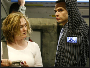
VIP Medicum, a beauty clinic in Tallinn, Estonia pulled off a controversial marketing stunt in the video you see above. They hired models to act as the “Before” and “After” result of their weight-loss program. Now, I realize that before and after photos are a standard in weight-loss advertising but to use real people? From what I understand the “Before” model didn’t mind but I think all that really means is that she really needed the money from her job. The models were required to hand out brochures for the clinic. I wonder if each model handed out the brochure for their own body type? You know what I mean,…
Signs TV Spot
The spot above was creatively executed it really rubbed me the wrong way. I guess I didn’t think it was appropriate to use explicit signs of social injustices to promote diversity in your creative department. I am sure that it grabbed the viewers attention due to the shock value, and I don’t think to many of today’s younger generation has been exposed to such a large compilation of signs with clear messages of social injustices. The client for the ad is the Spectrum Speaker’s Program, a program to promote racial diversity in an ad agency setting. The ad agency behind the spot is DDB Dallas. By the way, I thought…
Chalupas and Yankees
For the life of me, I can’t find out for sure who the ad agency behind the Taco Bell/ Yankees spot shown above is. I think it’s either TBWA Chiat/Day or DraftFCB but again I am not sure. If anyone knows for sure please leave a comment below. If you’ve watched any preseason baseball on TV then I’m sure you have all seen it at least once. The whole idea behind the spot is that they use a baseball metaphor to present the joke behind the spot. In the spot the rookie can’t finish the job of eating the whole Chalupa so the manager (Joe Girardi) pulls the rookie out…
Technorati Claim
Here is my Technorati blog claim token number 26RWN2BTZXUN. Best, -A.B.
Mercedes-Benz Goes Special for Pink
Mercedes got the “calligraffiti” artist Niels Meulman to create a work of art using the car above as a canvas to commemorate breast cancer awareness month. The artist wrote hundreds of women’s names on the car. Best,-A.B.
