Tide Pen
A very on the mark ad created by Saatchi & Saatchi, New York. I saw this at adgoodness. I had to write about this because of how well this print ad was executed. It’s one of those rare ads that I think people will understand right away. The product is the Tide’s pen to go. Best,-A.B.
Aussie Rum
Another weird commercial comes out of Australia. But this time the advertiser is Bundaberg Rum. The first weird Aussie spot I discuss was in a post titled Dirty, Dirty Dishes. In the spot in this post, a crew of sugar millers from the 19th centaury begin to heckle a modern day golfer because he chooses to shoot around the gigantic crocodile sitting in the middle of the green. My question is, why are all these elements together in the spot and what do they have to do with the rum being advertised? I can’t make a connection between any of these elements. As a matter of fact, all these elements…
LeBron, What Should I Do
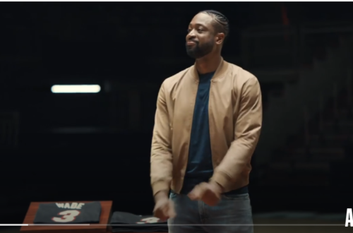
This commercial just aired during Inside The NBA featuring the new king of Miami, LeBron James. Inside The NBA aired right after the L.A. Lakers two-point win to start the 2010-2011 season. The spot several clips of LeBron in various situations like a press conference, poet, on a basketball court, in a construction site, all asking the question “What should I do? In the spot he also provides possible answers in question form like “Should I admit that I made mistakes?” Should I really believe I ruined my legacy? Should I have my tattoo removed? If you follow basketball like I do you would know that this commercial mocks the…
Thicker Hair Polamalu
Here is another spot for Troy Polamalu but this time for P&G’s Head & Shoulders brand. In the spot Polamalu uses the above mentioned shampoo when he shouldn’t have. Why shouldn’t he have used the shampoo? Because it’s only intended for people who want thicker hair, Polamalu obviously doesn’t need it. The spot, I believe was created by Saatchi & Saatchi, New York. Also, you should know that Polamalu’s hair was insured for 1 million dollars. Yeah, that’s some expensive hair. Best,-A.B.
Futuristic Coke Design
The image above is of a futuristic Coke bottle design created by Jerome Olivet. The bottle has a sort of Tron feel to it. Visualize the helmet from the movie and the rounded edges of the bottle; they are both very futuristic looking. The bottle is an awesome design that I wish I could have created myself. This post was found through Kiss My Black Ads. Best,-A.B.
Controversy with Calvin Kline Ad, Again
The ad shown above has brought controversy to the designer’s brand once again. CK has apparently had a number of ads brought into question over the years. The ad above was banned in Australia for suggesting rape. Some up-tight, authoritarian figure in the Advertising Standards Bureau thought the ad suggested a gang rape of the pretty lady above. To me, the ad could have easily been mistaken for a promotional poster for a new season of True Blood. Please take a look at the image below and look at how similar the images look. The pretty ladies in both ads are situated in a manner that looks extremely submissive, but…
Rip Curl Films
Surfing super-brand Rip Curl teamed up with Timeslice Films to capture surfers in “bullet time.” Bullet time is the camera effect seen for the first time in the 1999 blockbuster hit movie The Matrix. I wanted to share this with you guys because I got the sense this is yet another creative attempt at branded entertainment. One of the earliest cases of this, I remember reading about during my graduate school days was BMW Films. An interactive marketing campaign released on the Internet to help promote the new luxury car of that particular year obviously. Have any of you seen the BMW short films? Best,-A.B.
Become A Girl Toy
Really don’t have much to say about the spot above except it was really funny and well executed. The agency, & Co from Denmark made me think it was some sort of PSA to stop violence. But really, Jack & Jones is a jeans store. Anyway, who wouldn’t become a girl toy? Best,-A.B.
Disabled in Non Pity Ad, Success
I saw the ad above on Adfreak and I just had to write about it. Why, you ask? Because the featured model is missing a limb, it is extremely rare that a person with a disability is featured in an ad that doesn’t scream, “Pity me.” Granted the ad was created for a campaign to help raise awareness about disability issues in the French speaking area of Belgium. But be honest, disability isn’t the first thing you thought when you saw the ad? As somebody with an advertising background and a disability I was extremely proud of this ad. The advertisement—placed in newspapers and postcards distributed in restaurants around Brussels.…
Back to the Original, Logo
Gap reverted back to its original logo after an uproar from the online community only a week after making the initial change. The new logo was created by New York agency Laird & Partners. Now, trademark registration of the original Gap logo went through in 1972. But I can find out for certain who exactly designed the original iconic logo. So I’m going to assume the founders Donald G. Fisher and Doris F. Fisher designed it. People expressed their displeasure with the company by posting messages on Facebook and Twitter. People hated the ne logo, so much that a site called Design Your Own Crap Logo was created. Best, -A.B.
