Trump-Pence Logo Design is Quickly Replaced
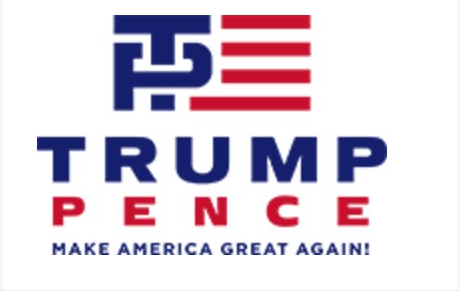
Friday, July 15th, the Republican Presidential candidate Donald Trump got a new running mate and a new campaign logo. The first version of the logo received so much ridicule online and otherwise that it was quickly replaced. Take a look at version one, no wonder people thought “Hey, that logo is NSFW (Not Suitable for Work).

Trump puts a square peg in a round hole with Pence. The logo comes from joint fundraising committee in the Republican National Convention (RNC). In my opinion, most people thought the TP stands for “Toilet Paper.” And of course the T going into the P, well that just didn’t leave anything for the imagination, so let the ridicule begin. People of course thought about anal sex, shit, ass wiping and and how much they dislike the candidate.
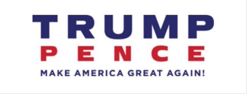
The logo of course got so much ridicule that it was quickly changed. The new logo now focuses on text rather than trying to develop letters that fit together again. See how boring the new logo is.
The logo makes no attempt at a creative graphic whatsoever. It is simply three lines of text, designed by someone who is afraid of being criticized by an entire nation. Let’s face it whoever designed the logo for the Trump campaign had no experience in design. This is why organizations pay big money to reputable design firms for their creative work that will be visible to millions of people.
Furthermore, we have to admit that some letter don’t go well together– Ps and Ts are two such letters. The exact opposite of logos such as Roger Federer‘s authoritative “RF” or the understated swagger of Kyrie Irving‘s interlocking “KI.”
Take a look at the Creative Bloq for some impressive logos that employ letters with perfection and class that the Trump campaign logo clearly does not have.


